
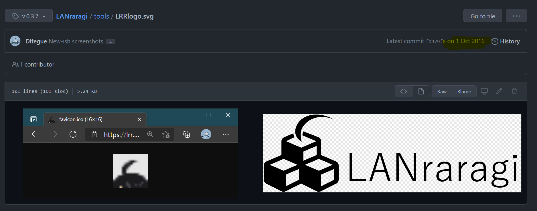
The favicon you've probably already seen a thousand times if you have a LANraragi install was ripped off from a Japanese Monogatari website sometime in late 2014. (get it b/c it's araragi and you see the ahoge and everything haha)
The logo came a bit later(late 2016), but it's essentially just an edit of the ubiquitous fa-cubes.
The favicon served me well enough, but it's starting to feel really low-res, and doesn't really work well on dark backgrounds.
As for the logo, it doesn't look very nice at low resolutions either if I were to make it the new favicon.
Therefore, I've been wanting to update the LRR logo in order to make it:
- Legible/Recognizable enough at low resolution
- Work on both light and dark backgrounds
- Not a ripoff of existing art (don't want to risk a lawsuit from aniplex and fontawesome if i ever make it big i swear on me mum they'd do it we live in a society)
while not losing what makes it unique, by which I mean keeping the ahoge motif.

Thoughts and process
Neumorphism is the new design meme, but outside of outlandish dribble mockups it seems to just translate to softer shadows and more transparency, with a little bit of 3D thrown in.
Not a design expert please don't scream at me for not getting it
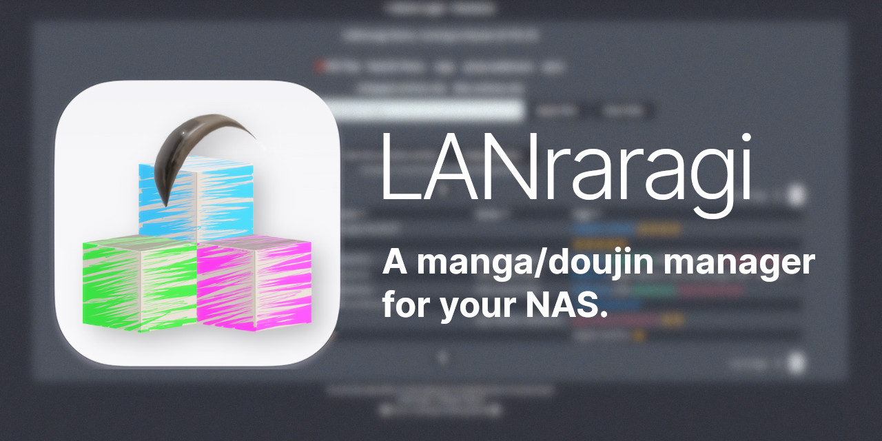
So, let's make a 3D icon! Using the one and only free 3D tool all grand designers use, Blender Paint 3D by Microsoft:
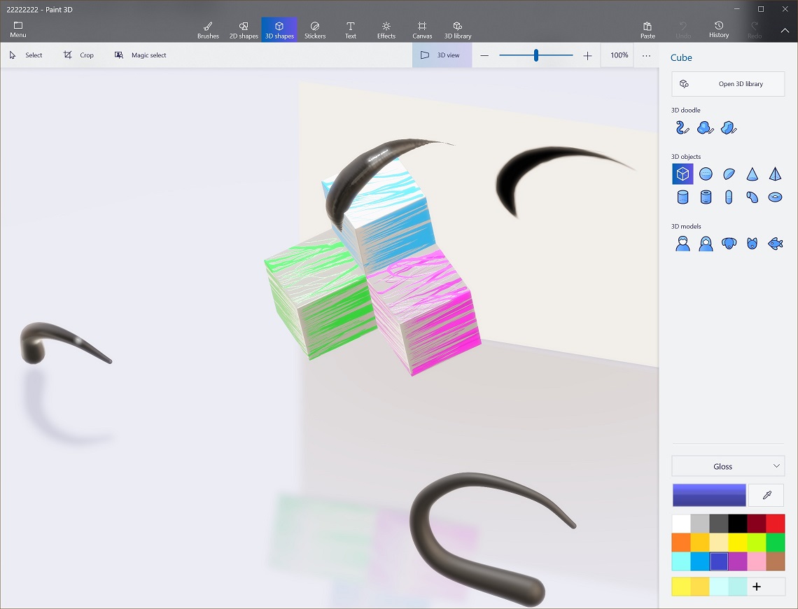
I took the existing 3D logo I'd already made for the 5 years hacktoberfest, and started iterating from there.
To help with recognizing the icon at low-res, the best thing to do was to bring in some color to the blocks.
The color scheme was inspired by the WinRAR icon, since LRR deals with archive/compressed files basically all the time!
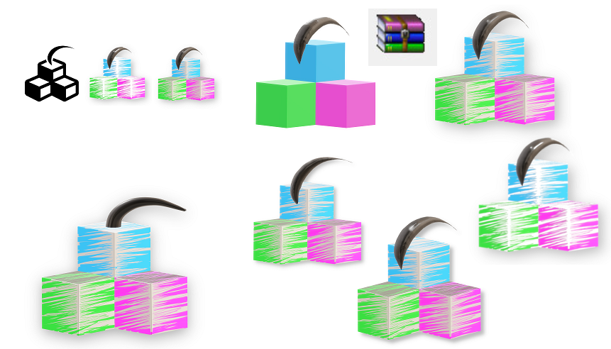
Fully coloring them looked kinda garbo, so I went arthouse and just scribbled some lines.
Paint 3D did a surprisingly good job at handling the breadth of the lines depending on the depth, and it reminds me of the NeXTSTEP blocks so I like it:
I was kinda scared of the 3D ahoge looking like a piece of poop straight outta Duke Nukem Forever with the glossy lighting and low polycount, but thankfully it looks quite good after some post-processing in Photoshop GIMP to smooth it out.
I really dig the way it's positioned though! It pops out way more than in the previous icon, and having it rotated to the side brings a lot of extra depth.
Having it burrowed a bit more into the blocks also makes it recognizable even at low resolutions. and it kinda looks like a parasitic slug so that's cool
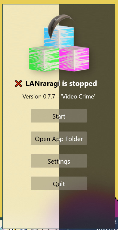
The design doesn't fare as well as I'd hoped on dark backgrounds however, so I slapped a squircle straight out of the Apple playbook for the icon variant.
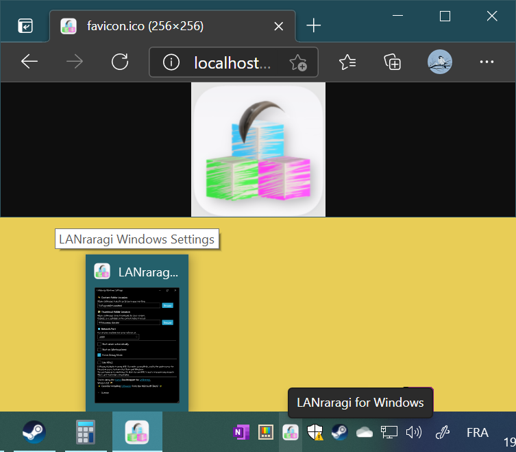
It looks a bit weird on Windows since squircles aren't really a thing in MS iconography, but the Windows app is just a launcher anyways so eh ¯\_(ツ)_/¯
Closing thoughts
m8 this icon thing is easy who needs designers rite just slap some 3D blocks and ur good
I wanted to name 0.7.7 Video Crime at first since it's basically the only Tin Machine song I like, but since I pick the Bowie song names proportional to the quality of the release, and 0.7.7 was super huge, I went for Pallas Athena instead.
Probably my favorite song from Black Tie White Noise, although I love most of the album it's real darn good
I took the opportunity to remake my OpenGraph Github splash as well, using Inter as the typography:
I'll kinda miss the low-res GIMP pepper from the previous version.

