Stylophone has been out for almost a year now, and has received as warm a welcome as I could've hoped in the (very) niche world of MPD clients.
There's been more than 400 trials, and about 100 paid users, which makes this the first time I got any significant form of money from the Microsoft Store. 💰💰💰
Version 2 of the app has been in the works for a few months already, as I was expecting some form of rejuvenation in the UWP space due to WinUI 3/Windows App SDK.
The Windows 11 announcement delivered all of that and some!
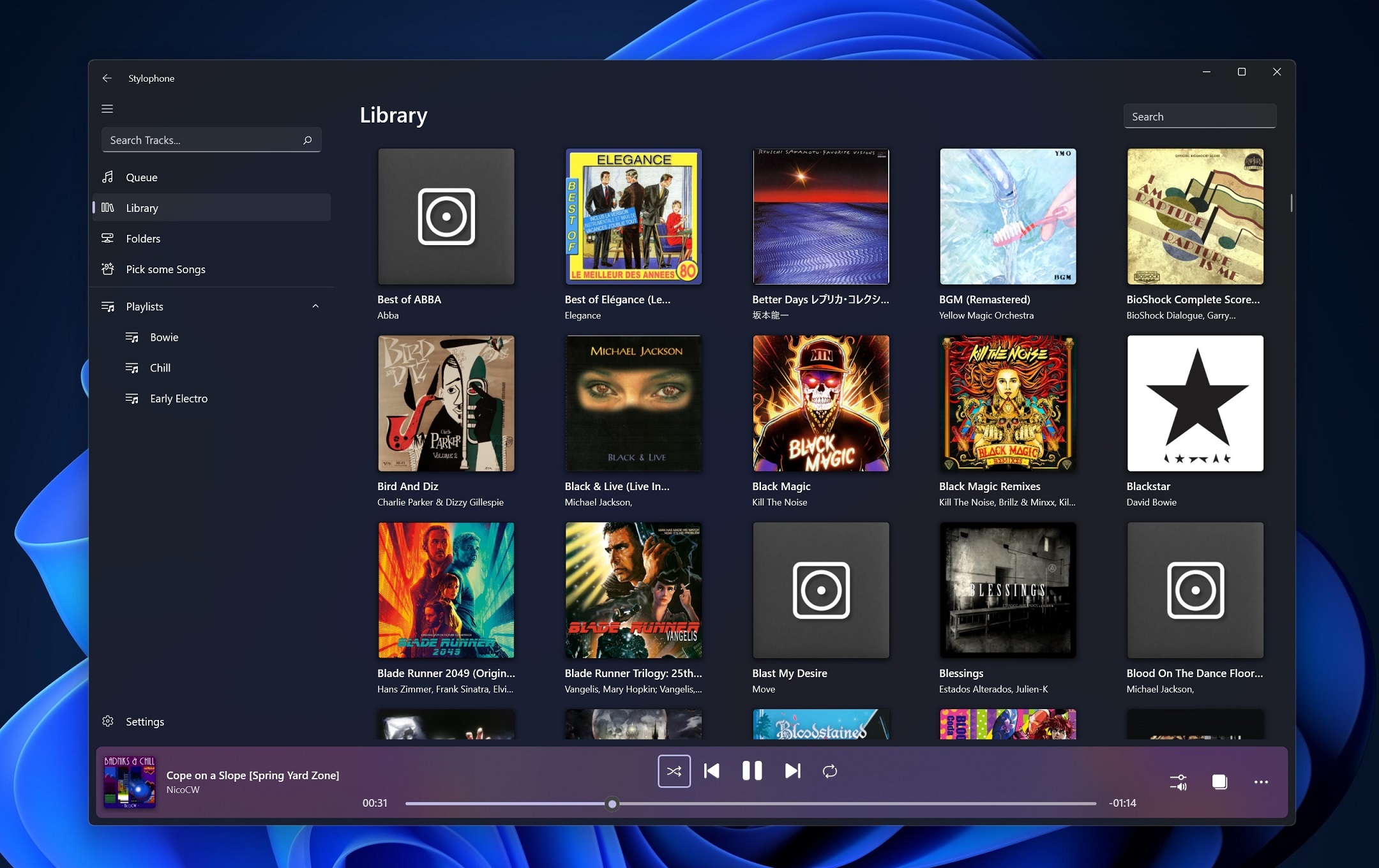
As a part of Launch 2021, I'm releasing Stylophone v2, featuring :
- A fully rebuilt app, eliminating a bunch of bugs
- Complete restyling using WinUI 2.6 (The bottom area is finally not stuck in dark theme anymore 🙏)
- Support for password-protected MPD servers
- Local Playback if your server has the httpd stream output enabled
- Random shuffling of tracks from your library into the play queue
V2 is now live on GitHub and the Microsoft Store!
I'll be rambling a bit more about what I did below.
Windows 11 Redesign
In v2, I spaced most of the UI elements further, both to fit the new card-inspired design language of Windows 11 and to give some elements the extra breathing room they really needed.
(Those image comparison sliders are iframes! If they're not showing up your browser might be blocking 'em for some reason. 🤔)
v1's playback controls always felt borderline-claustrophobic to me, with the time slider almost touching both the Play/Pause buttons and the window border.
This comes at the loss of a bit of vertical space for the content, but I felt it was fine. (And if it's not, you can always enable compact sizing in the settings!)
This time around, I've mostly copied looked at the revamped Settings and Microsoft Store for inspiration. (There's not much else in terms of released WinUI 2.6 apps at the moment. 😛)
I've also updated the icon! I liked v1's icon a lot, but it looked a bit too much like the MS Office icons. (A recurring theme for third-party Fluent Design apps at the time for some reason)
It also looked kinda muddy at small sizes, so I've cleared it up and changed the shape to something...still generic, but more legible at small sizes. The "S" is much less noticeable, which I think is fine since it's kinda just a signature.
![]()
If you preferred the old icon, well, how about buying a sticker of it to reminisce about the good old days? 😉
(Re)building the app
The structure of the app has switched from 2 projects to about 5:
Alongside the existing MpcNET library that's used to handle all the communication with MPD servers and the UWP project itself, I've split most of the core business functionality into a separate .NET Standard class library, which can be reused outside of UWP easily. (More on that later)
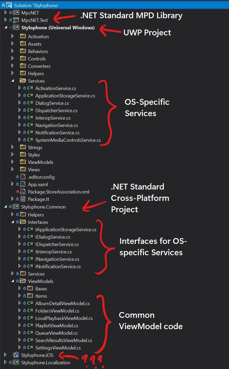
Achieving this was relatively easy(albeit time-consuming), as the app already uses the MVVM paradigm through the Community Toolkit's MVVM library.
The major switch I made was to use Dependency Injection, which allows me to easily use the OS-specific services within the common ViewModel code, by simply injecting them as implementing the interface.
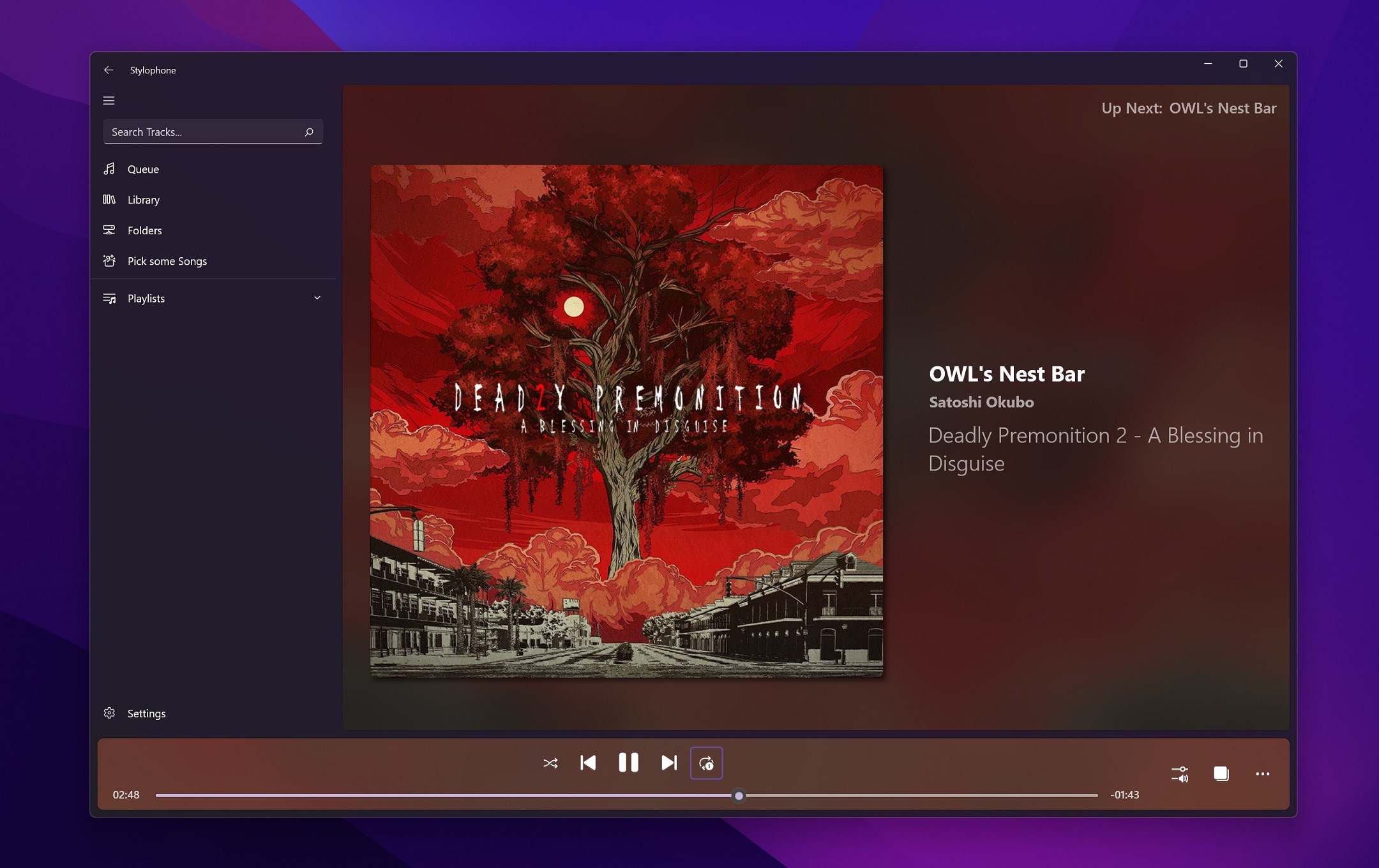
Another big change I made was to handle all the album art decoding and storage in the .NET Standard portion of the code, using SkiaSharp.
This allows me to greatly cut into the amount of Dispatcher calls I had to make to use the native/UWP image functions, at no real performance loss. (And a great improvement to code readability.)
The new Local Playback feature relies on the MPD server's httpd output, which makes a nice stream we can consume and play back on the Windows machine.
I used the UWP MediaPlayer for this, which does the job well enough. Your mileage with this feature may vary, as I sadly have no way to figure out the encoding used by the server and use its default, which is ogg.
Ports?
As said above, I rebuilt the entire app to have as much .NET Standard code as possible.
The main goal behind this was to port the app to other platforms. I tried Uno Platform, sadly walked back dissatisfied with the results (forced solution structure, lots of time wasted installing nuget package clones, etc), and tried elsewhere.
👉 My first look was at Xamarin Forms/MAUI: I quickly reached a working prototype but felt I wouldn't be happy with the UI options available and stopped there. (Besides, I don't really care about Android)
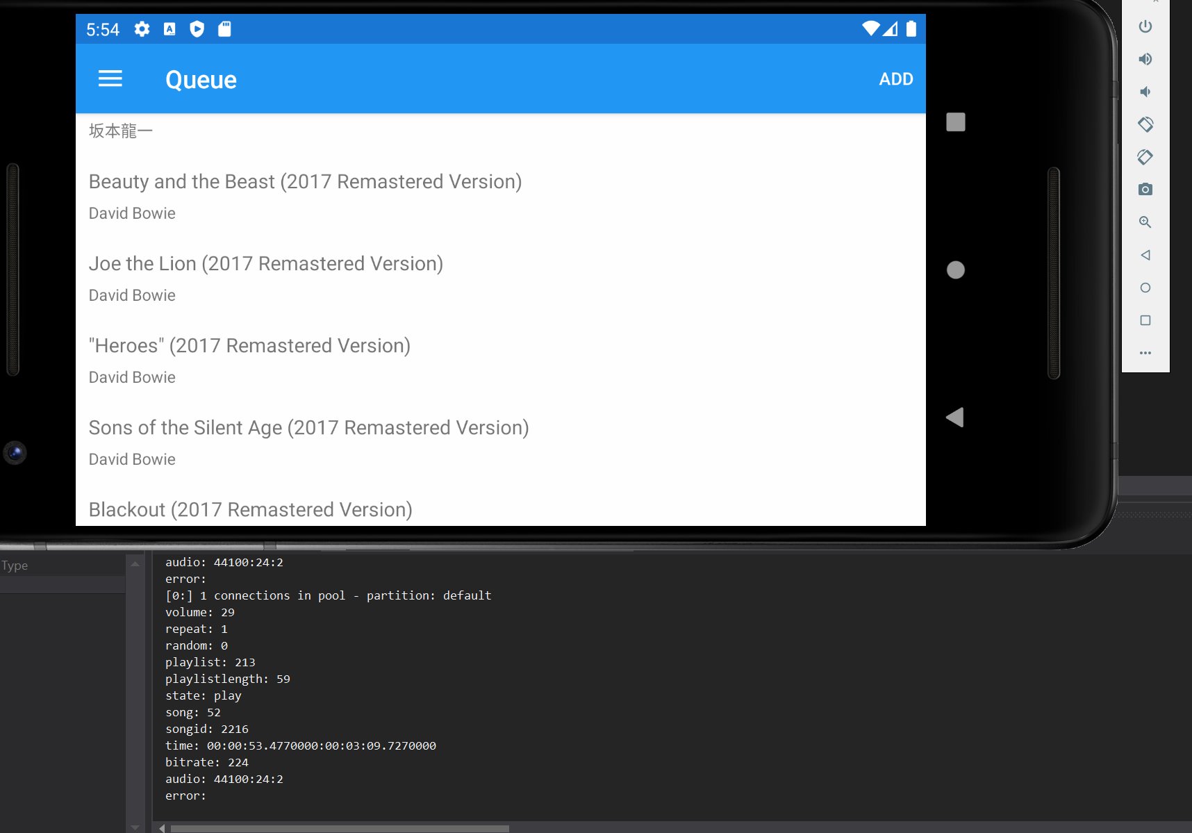
👉 I briefly considered Avalonia, but I generally don't like UI frameworks that don't try to look native to the platform they're running on. (This has been greatly improved recently! I might take another stab at it one day.)
👉 In the end, I decided to try a port to iOS/UIKit, using Xamarin.iOS whose macOS variant I was already familiar with.
Y'know, just 'cause it'd be funny to port a UWP app to run on Apple's own twist on Universal Apps.
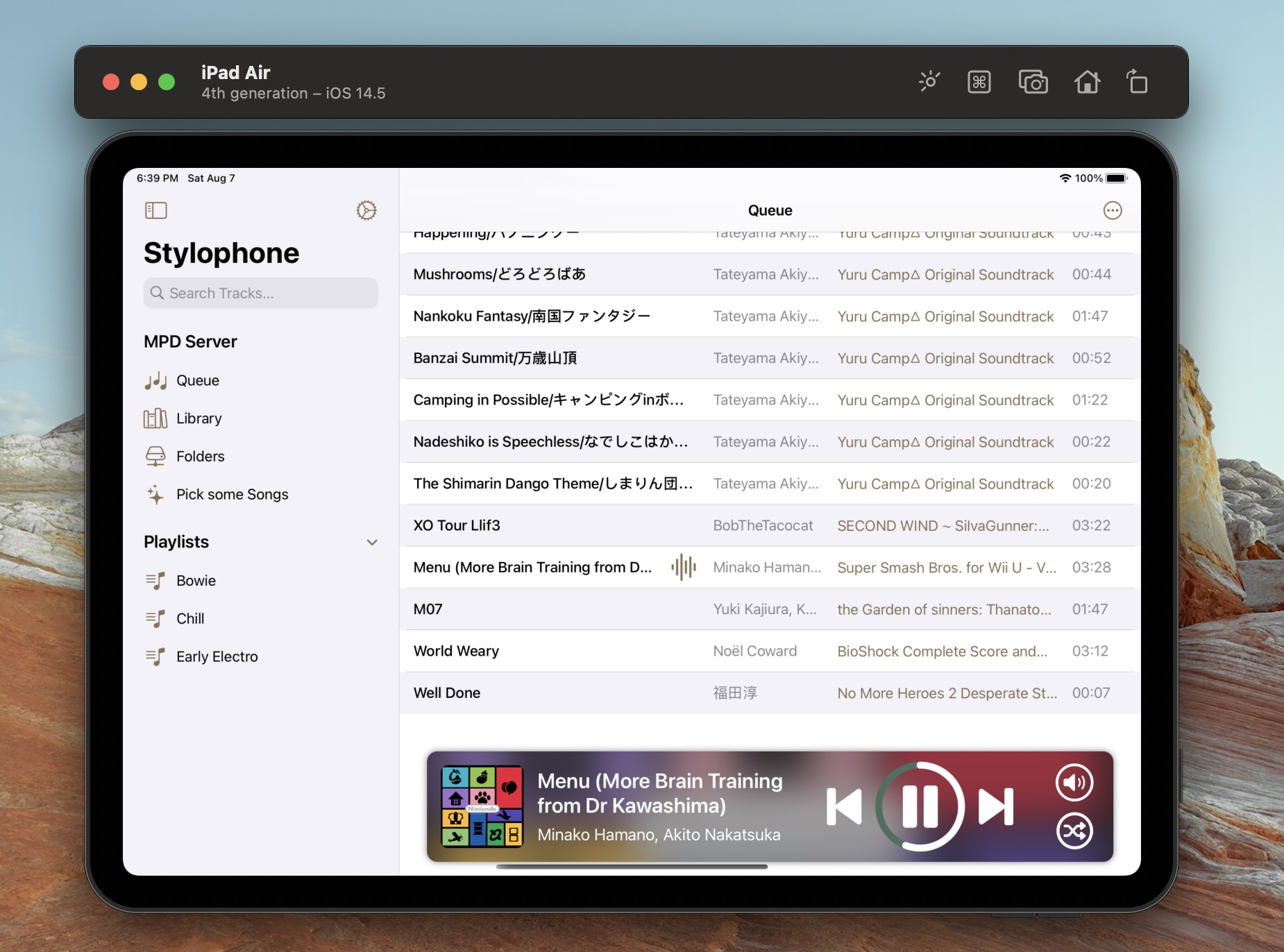
As you might see, I got a lot further with this port!
This is all native iOS UI, powered by the same .NET Standard core as the UWP app.
I learned iOS development from scratch while doing this, which probably led to some bad decisions on the way. 😛
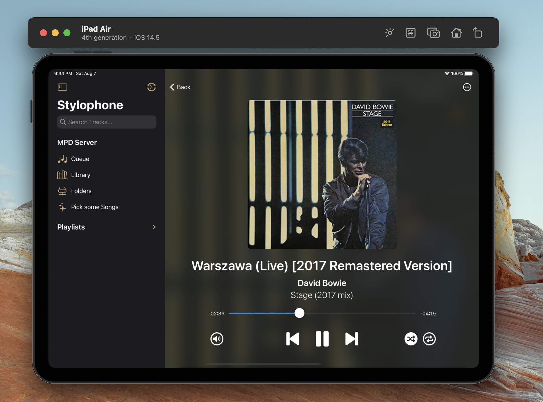
This is where I'd normally drop a surprise App Store link, but I'm not sure if the app actually looks good enough/would be successful on Apple devices?
And if I'd eventually make back the 90$ a year Apple charges for a developer license, good lord Microsoft has spoiled me with the one-time 100$ payment which I didn't even pay since I got a student deal back in 2013
So, consider those screenshots kind of a pitch from me for the time being. 😅
It's open source just like the UWP variant, so if you like what you see, compile it and give it a try! It's about 80% finished.
I might come back to it when Xamarin adds support for Mac Catalyst, as it'd allow me to target three platforms with this port.
Closing words
Some line of code counts! It's not really a meaningful metric but it's fun:
| Project | LoC (C# only) |
|---|---|
| .NET Standard | 4963 |
| UWP | 3111 |
| iOS/Xamarin | 4537 |
The UIKit port needed a bit more glue code than I was expecting since unlike macOS/AppKit, UIKit doesn't really have a simple way to do data binding.
(I'm aware of Combine, but Xamarin.iOS doesn't really allow you to write Swift at the time. 😔)
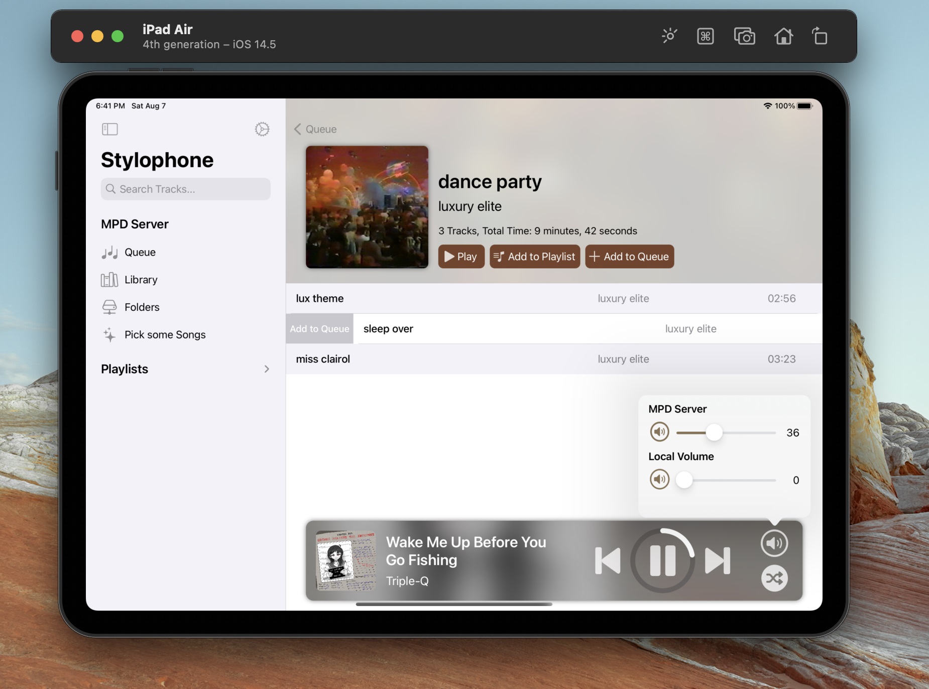
iOS has slide actions on rows which I find really cool and never really used before -- I think it's a bit too hard for users to find out about, though. 😐


